SCHKM

Minimalist coffee can design in hand – black and white packaging with bold typography

project overview

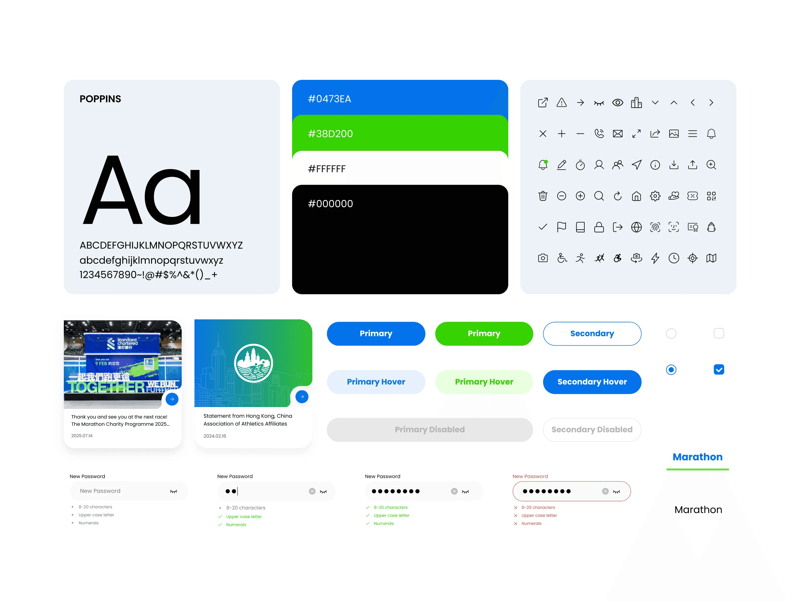
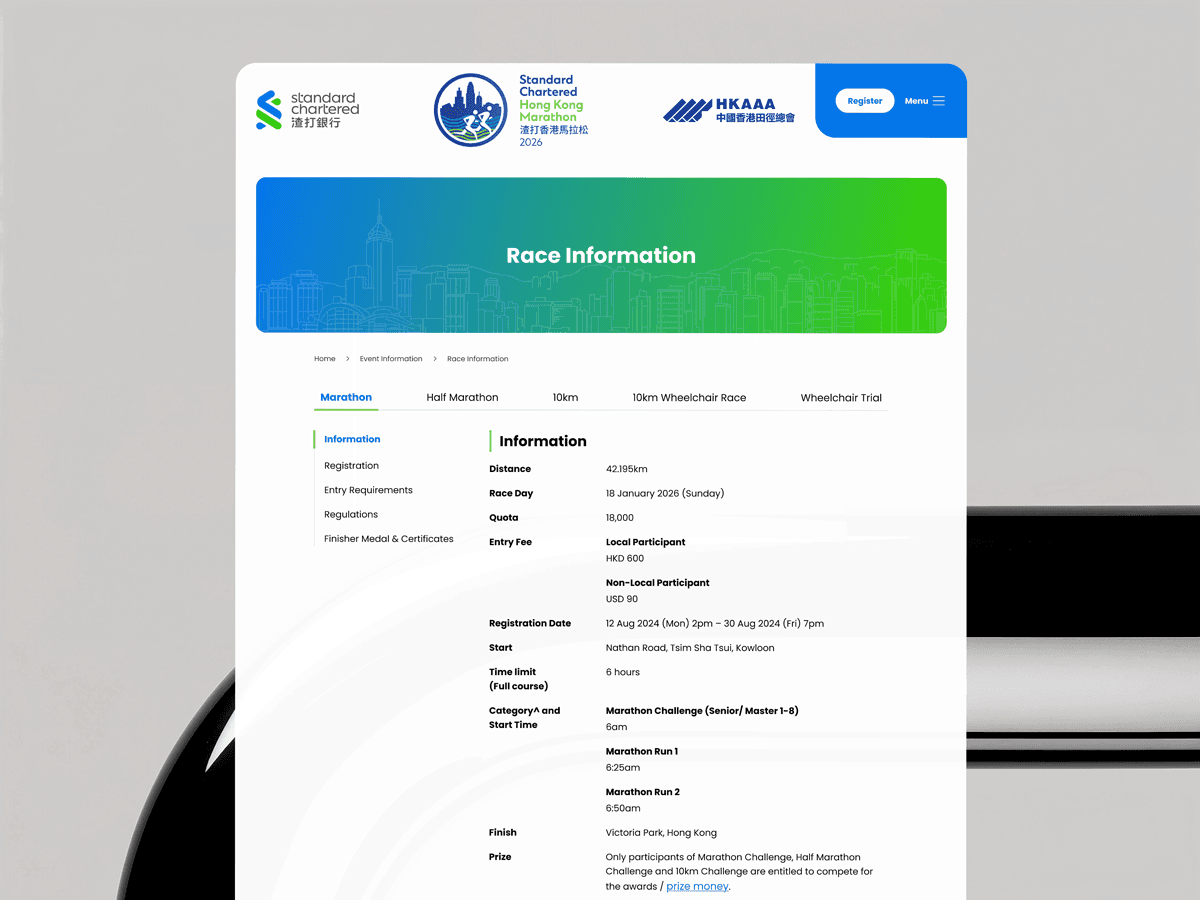
redesigned the official standard chartered hong kong marathon website to serve over 70,000 runners. under an 8‑week deadline, i implemented a component-based design system that modernized the brand experience, improved mobile usability, and allowed the team to update content efficiently.

project type

Public event marketing website

year

2026

my role

UXUI Designer

client

schkm

Design System
Vertical coffee can mockup with clean monochrome label design
Top view of coffee can mockup with bold black typography on white background

challenge

the legacy wordpress site was outdated, not mobile‑friendly, and difficult to navigate during peak traffic before race day.

the legacy wordpress site was outdated, not mobile‑friendly, and difficult to navigate during peak traffic before race day.

Solution

I reworked the information architecture and designed a modular UI kit using Standard Chartered’s brand colors, enabling reusable page sections and faster development.

I reworked the information architecture and designed a modular UI kit using Standard Chartered’s brand colors, enabling reusable page sections and faster development.

result

The redesign was approved with no major revisions and made race information significantly easier to scan on mobile.

The redesign was approved with no major revisions and made race information significantly easier to scan on mobile.